How To Nest Blocks Within Blocks in BEM
December 05, 2019
When you’re practicing the BEM methodology and you have components within components, it’s difficult to know the most efficient (and BEM best practice) naming convention to follow.
In this article, I’ll tackle how to solve for this common issue and follow BEM best practices.
You’ll be able to use blocks within blocks like a BEMi master.
 I couldn’t resist a Star Wars joke… Especially as BEM kinda works like lego
Ready? Let’s dive in.
- Nesting blocks within blocks
- Using BEM modifiers to tweak component styles
- When to use element and block classes together
- Conclusion
Nesting blocks within blocks
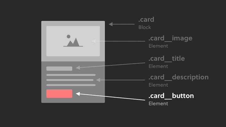
Let’s use the card component as an example for nesting blocks within blocks.
Typically you might have a button inside the card.
 While this approach follows the BEM methodology, there is a more modular way. Continue reading for that.
Here’s how you might write the HTML using BEM:
<div class=“card”><img class=“card__image”><h2 class=“card__title”>I am a card</h2><p class=“card__description”>I am the card paragraph</p><!-- The button is an element inside the block --><a class=“card__button”>Learn more</a></div>
This code follows the BEM methodology.
However, something might feel wrong to you, as buttons are typically used in various places across a website, so designing a button that just lives inside a card would be pretty inefficient.
And that’s the trick here. You need to ask yourself:
“Does this ‘block’ I’m about to build consist of sub-components that can be used in other parts of the website?”
Or put another way:
“Could this BEM element I’m about to add to a block be used as a component in other areas of the website”
If the answer is yes (like in the case of the button in a card), then you can do this:
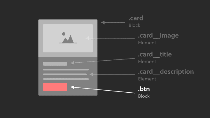
Simply turn the element into a block.
Therefore, it’s reusable as a standalone component, or usable inside other blocks (like in the case of the card example):
<div class=“card”><img class=“card__image”><h2 class=“card__title”>I am a card</h2><p class=“card__description”>I am the card paragraph</p><!-- The button is now it's own block --><a class=“btn”>Learn more</a></div>
That’s how you place a block within a block using BEM.
It really is that simple. And yes, this does follow BEM best practices.
Here’s a list of common blocks that can be placed inside other blocks:
- Buttons
- Form fields
- Form labels
- Cards
- Navbar
- Media objects
Get in the habit of thinking atomically about your components and you’ll start to spot them everywhere.
Using BEM modifiers to tweak component styles
Now, you might be thinking…
“Hold on! What if I want my normal buttons across the website to be red, but all buttons inside cards should be green?“
That’s where BEM modifiers come in.
<div class=“card”><img class=“card__image”><h2 class=“card__title”>I am a card</h2><p class=“card__description”>I am the card paragraph</p><a class=“btn btn--green”>Learn more</a></div><style>.btn {background: red;colur: white;border-radius: 4px}.btn—-green {background: green;}</style>
In the CSS, you can see that the .btn-—green is written after the .btn class, meaning that if there are any duplicated declarations, the .btn—-green class takes priority because of CSS specificity rules.
Using the BEM modifier allows you to have a core .btn component, and modify the style where relevant.
When to use element and block classes together
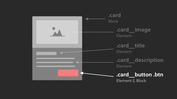
There might be some cases where you want to use BOTH the element and block class.
For example, let’s say we want the button to be aligned to the right:
It might feel a bit wrong, but applying both the element and block class is a valid way to handle such a situation:
<div class=“card”><img class=“card__image”><h2 class=“card__title”>I am a card</h2><p class=“card__description”>I am the card paragraph</p><!-- The element AND block class is applied to the button --><a class=“card__button btn”>Learn more</a></div>
Of course, you could consider using a modifier on the button (like in the previous example above) to align it to the right.
Whichever approach you take, the key is just to be consistent in your approach moving forward.
Conclusion
I hope that cleared up any confusion you had about nesting blocks within blocks!
Here’s a quick summary overview:
- When you’re unsure if something even is a block, ask yourself: “Could this BEM element I’m about to add to a block be used as a component in other areas of the website?”
- Stick to the block naming convention when you’re placing a block inside another block
- Leverage BEM modifiers if your blocks vary in style across your website
- It’s a valid approach to apply the element AND block class together
Want to become an advanced CSS & Sass developer?
Levelling up your CSS & Sass skills in 2021 is a great idea. Here's why:
- Increase your employability and value as a front-end developer
- Learn how to style your websites and applications in clean, efficient code
- Use tooling and techniques like BEM, flexbox, grid & more to improve your code


