Learn BEM with CSS Examples (From Real Websites)
December 02, 2019
Learning BEM can be a little abstract without looking at real CSS examples of how it’s applied.
So in this article, I’m going to dive into a CSS example using Airbnb’s design as a guide.
Ready? Let’s go.
Airbnb’s Call To Action
In the hero of some of the Airbnb landing pages, they use a CTA (i.e. ‘call to action’):
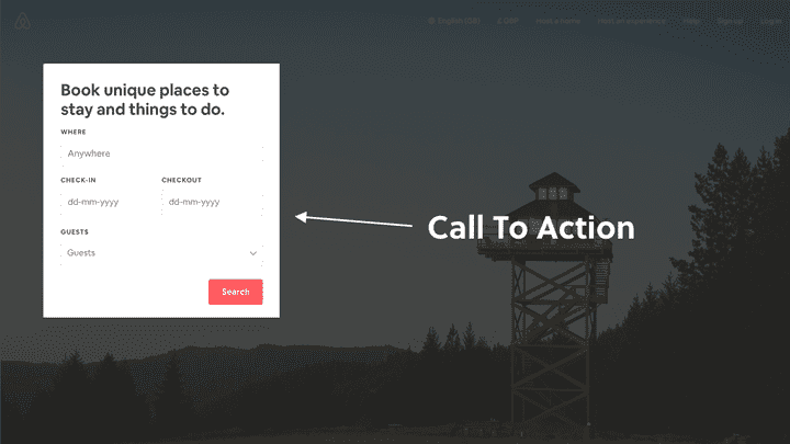 Airbnb use a call to action section on some of their landing pages. We’re going to design this in CSS using the BEM methodology.
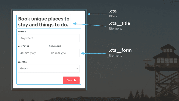
Breaking down the design to follow the BEM methodology, here’s how one could structure the CSS classes:
Groovy.
Before we dive into some CSS examples, you might be thinking…
“Shouldn’t the form be a block itself? In fact, shouldn’t the form fields and button be blocks themselves too?”
If so, you’d be correct.
Any component which can be reused independently should be styled as a block (even if it lives within another block).
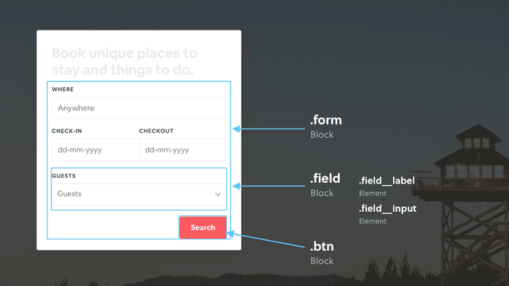
So the better way to structure the CSS classes to follow the BEM methodology would be:
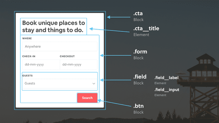 Don’t be afraid to place blocks within other blocks. Keep reading below to see how we’ll handle that in the CSS.
Blocks within blocks is something you’ll come across frequently when using the BEM methodology. We’ll cover how to handle that in the following CSS examples.
With all that being said, let’s dive into some code!
Let’s break it down piece by piece
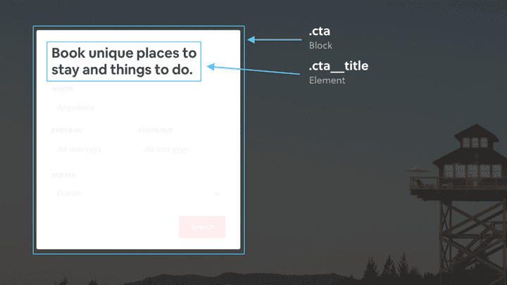
Starting with the parent .cta block itself:
We can add the relevant block and element CSS classes to the HTML:
<div class="cta"><h1 class="cta__title">...</h1><form><div><label>...</label><input></div>...<button>...</button></form></div><style>.cta {}.cta__title {}</style>
Now we have the parent .cta block setup, let’s add the blocks which are nested inside:
<div class="cta"><h1 class="cta__title">...</h1><form class="form"> <!-- Form block class added --><div class="field"> <!-- Field block class added (with elements) --><label class="field__label">...</label><input class="field__input"></div>...<button class="btn">...</button> <!-- Button block class added --></form></div><style>.cta {}.cta__title {}.form {}.field {}.field__label {}.field__input {}.btn {}</style>
Great! The .form, .field and .btn blocks are now styled independently and can be used elsewhere.
To dive into a full on example and play around, take a look at this codepen:
And that’s it! We’ve followed the BEM methodology and re-created the Airbnb call to action.
Want to become an advanced CSS & Sass developer?
Levelling up your CSS & Sass skills in 2021 is a great idea. Here's why:
- Increase your employability and value as a front-end developer
- Learn how to style your websites and applications in clean, efficient code
- Use tooling and techniques like BEM, flexbox, grid & more to improve your code
